Thursday, October 25, 2012

Johanna Calligraphy vs. Cursive

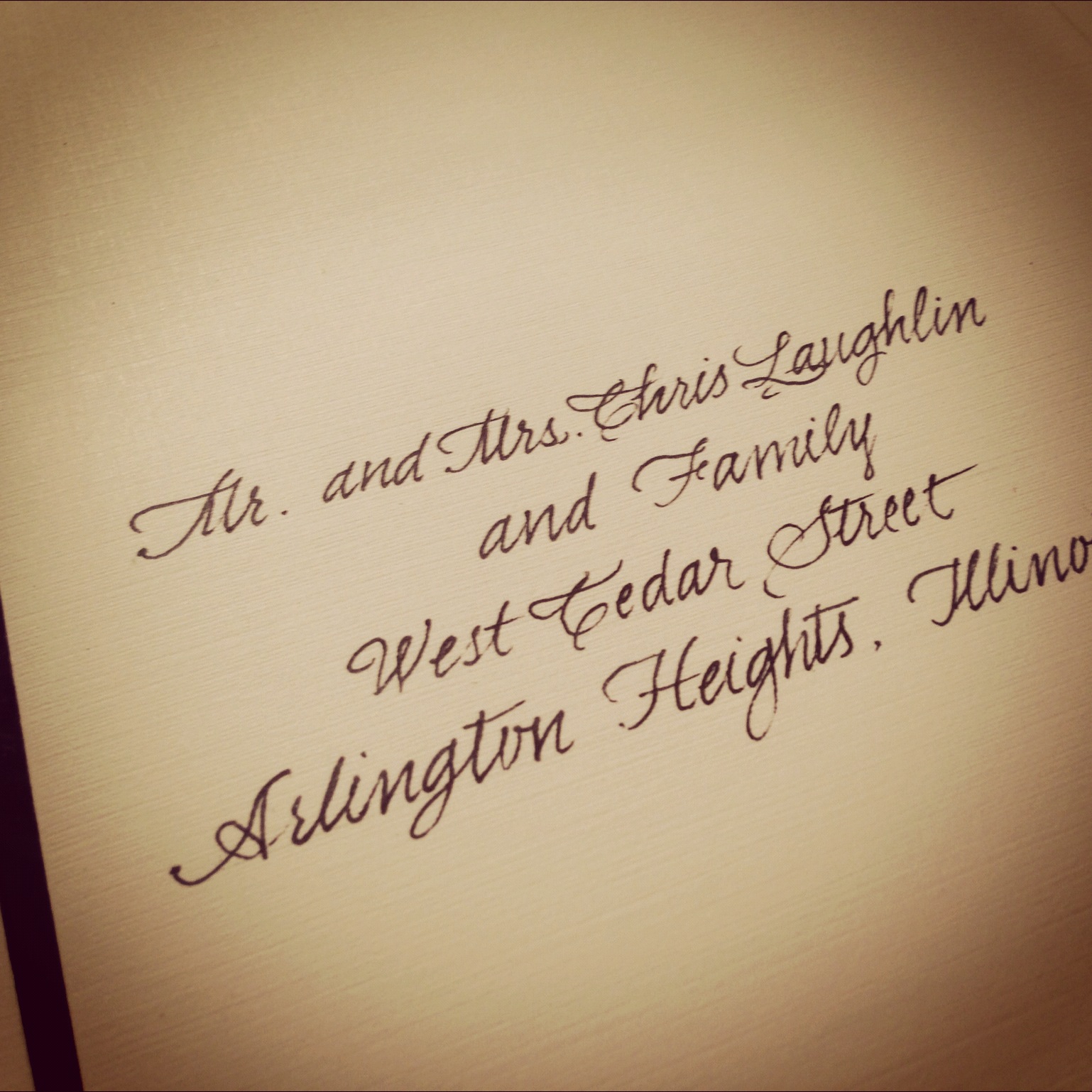
To me, calligraphy styles are more visually pleasing. I think it has to do with the varying letter thickness, which we perceive even subconsciously. The thickness varies with the angle at which the pen is held.

We're all familiar with Times New Roman. Have you noticed that the letters have changing thickness? You could conceivably write Times New Roman with a calligraphy pen, but not with a ball-point pen. The font Arial, though, has uniform letter thickness. I'm a Times New Roman person more than an Arial person, so I'm with the calligraphy crowd. Plus, it's what I do, so.

A few examples below might help you make up your mind.


Calligraphy:

Calligraphy, fountain pen
Calligraphy, using a calligraphy marker


Handwritten styles:

Cursive, with ball-point pen

Cursive, more flourish, with ball-point pen

Handwritten, cursive, with thin Sharpie


Monday, September 10, 2012

There's no Justice in the World

"And there never was." — Muse: A Soldier's Poem, Black Holes and Revelations, 2005

Friday, June 8, 2012

Gothic Style

I keep waiting for that magical Transylvania, Romania address, but it just doesn't happen. Illinois will do for now.

Friday, May 18, 2012

Return Address?

While it's true that it looks more formal, and more formal is often synonymous with classier, writing you return address in calligraphy is not something for everyone. It's more expensive, more time-consuming, and frankly, not at all necessary, in my humble opinion. That doesn't mean you have to skip it if that's what you want to do. But the alternatives are just as nice: preprinting or personalized stamps.


Monday, April 30, 2012

Keeping it Neat

Clean, neat italics can have as much impact as their more colorful, flourish-y counterparts.


Thursday, April 5, 2012

Gel Pens

My most loving mother was an English teacher, and as a direct consequence I have many memories of visiting the school supply store when I was a kid. I used to love the pens section; all the different colors you could want and a little pad to try them all out on... Gee, I should've known it would turn out like this.


My Stash

These are lyrics to the song "The Only One" by the Black Keys from their album Brothers.


Purple Ink

Wednesday, March 21, 2012

Random Pictures

I'll get bored every now and then and end up writing lyrics to a song, some line stuck in my head. If I have a pen it ends up being in calligraphy. If I like it, I'll take a picture. Here are a few examples.


Saturday, February 4, 2012

Saturday, November 12, 2011

White on Black

Black envelopes require thick inks, preferrably light colors. Gel pens work best, as usually fountain pen inks are thinner. Metallic inks are my favorite on black stationary.


(any resemblance to fictional heroines is purely coincidental)


Silver on Black


Saturday, November 5, 2011

Quickie Placement Cards

About a hundred of these placement cards were written in less than two hours the blank tent cards were inexpensive and perfect for the job. The calligraphy style matched the invitations.

Placement Cards

Tuesday, October 4, 2011

Amazing Grace!

I love Elizabeth Grace's website! I wish I could quit my job and work there for free.
Love love love

Thursday, July 28, 2011

Practice Price

I want to explore some wedding invitations addressing styles that I've only practiced before. I need to work on a full project in order to get some experience in these styles, so I'll be offering "practice" prices for a few small projects. These prices would be:
$1 for each outer envelope and $1.25 for outer/inner set using a simple pen in cursive styles (such as Commercial Script – below)
$1.50 for each outer envelope and $2.00 for outer/inner set using the fountain calligraphy pen (some samples in the Styles tab)
I'd like to keep it under 100 invitations, but I need the practice, so if I can't find anyone under 100 invitations I may have to work out something. We'll see how this goes! Email me if you think you're a candidate.

Wednesday, January 12, 2011

New Gothic

Gothic style is heavy but can be very lovely. I use it to fill out names on certain diplomas and when I feel like I need a little drama in my notebook. The example below would not please an instructor, as the style is supposed to stay away from curves. But that was then and this is now!

Personalized Gothic

Johanna

Ok so it's not called Johanna. Johanna is just my name.